
Brand Identity, Packaging Design
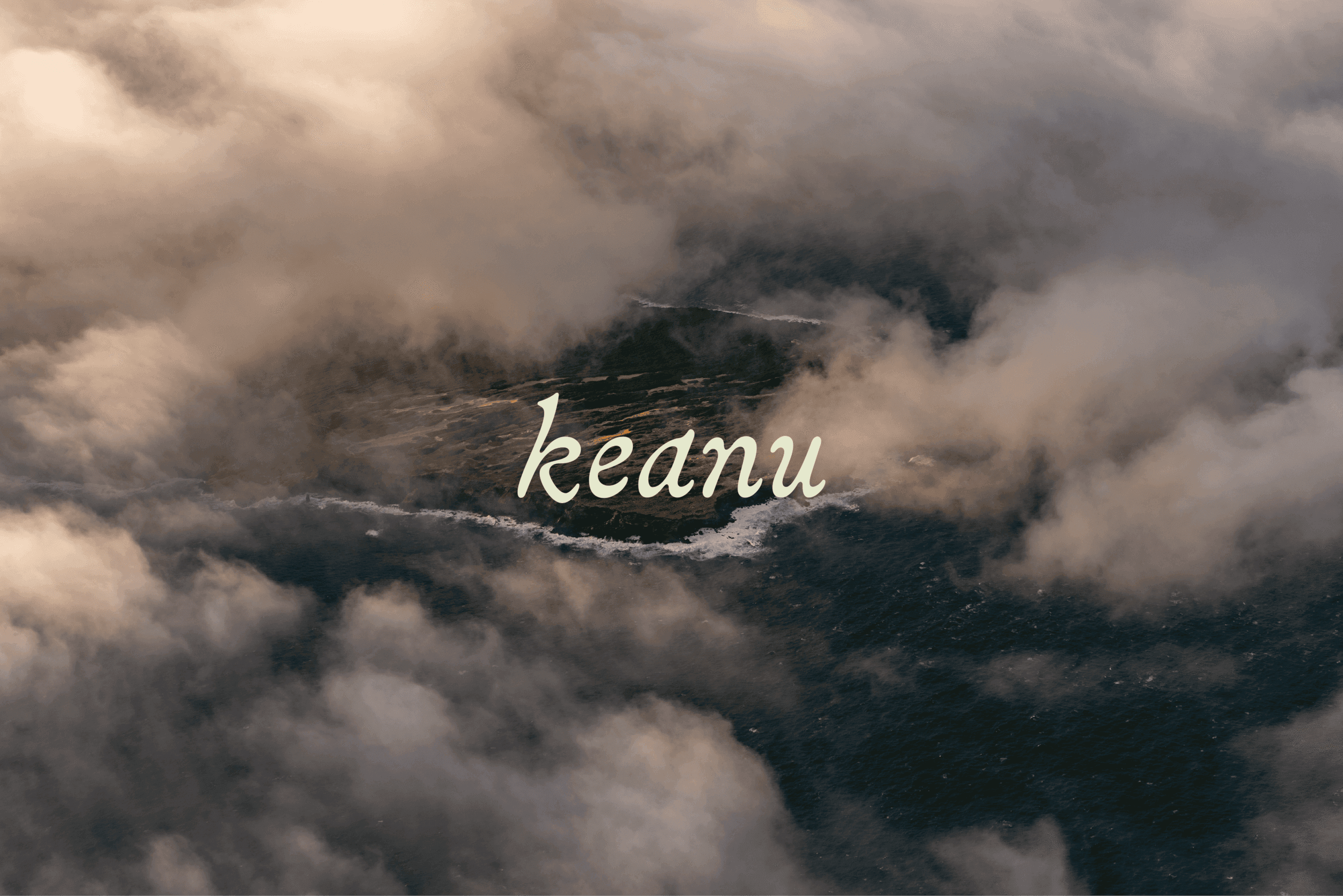
Keanu
About
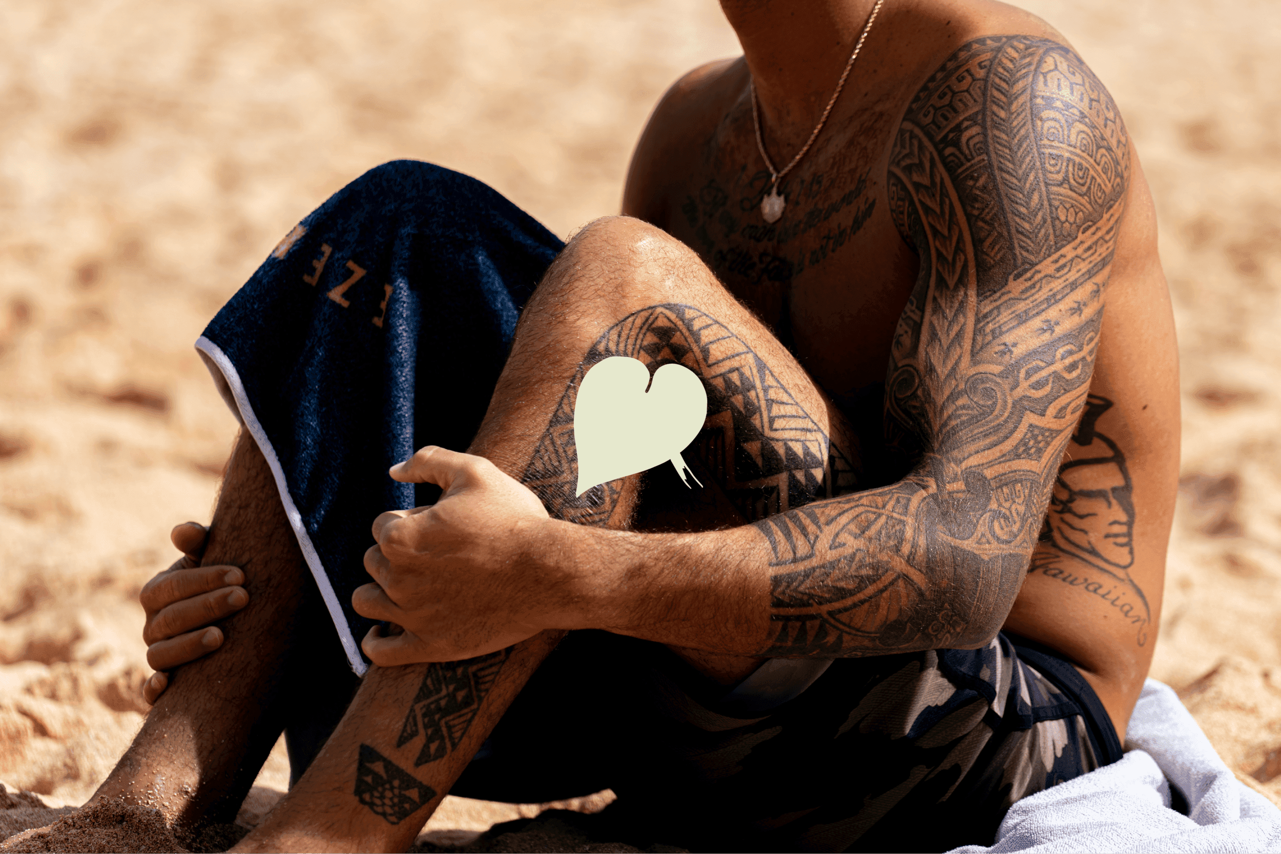
KEANU came to our design studio with a challenge: how do you honor centuries of Pacific Island tradition while making kava approachable for a new generation? The answer lived at the intersection of heritage and innovation. We crafted a brand identity that feels both timeless and immediate — grounded in kava’s rich cultural legacy but speaking fluently to modern wellness seekers ready to reimagine their social rituals.
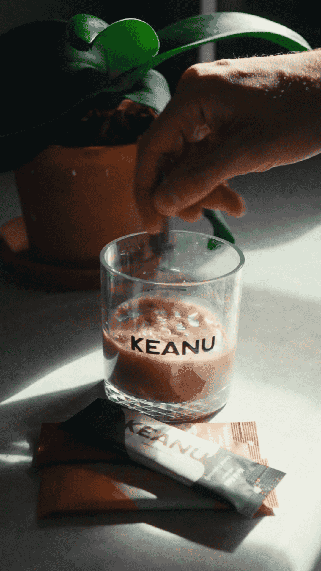
The packaging became our canvas for storytelling. Clean, confident typography paired with a sophisticated color palette that nods to the Pacific Islands natural beauty without falling into tired tropical tropes. Every touchpoint, from the instantly recognizable primary packaging design to the verbal identity, reinforces the KEANU mission: this isn’t just another beverage, it’s a movement toward mindful enjoyment.
meet the edge developed a complete brand system that travels seamlessly across every experience — from shelf presence to digital community. The result is a brand that educates without lecturing, invites without excluding, and stands out in the alcohol-alternative space with authentic confidence. KEANU doesn’t ask permission to be different. It simply is.


More work

